Making-of: Ibex-Paradise Pontresina
A look at the process of how we designed the Pontresina poster. From sketch to brand message for tourism organisations.
The tourism managers at Pontresina Tourism approached me with the desire for a travel poster for Pontresina in the tradition of classic tourism posters, but with a contemporary execution. The only brief was: there must be an ibex on it. Which is hardly surprising – Pontresina is home to one of the oldest ibex colonies since the species' reintroduction.
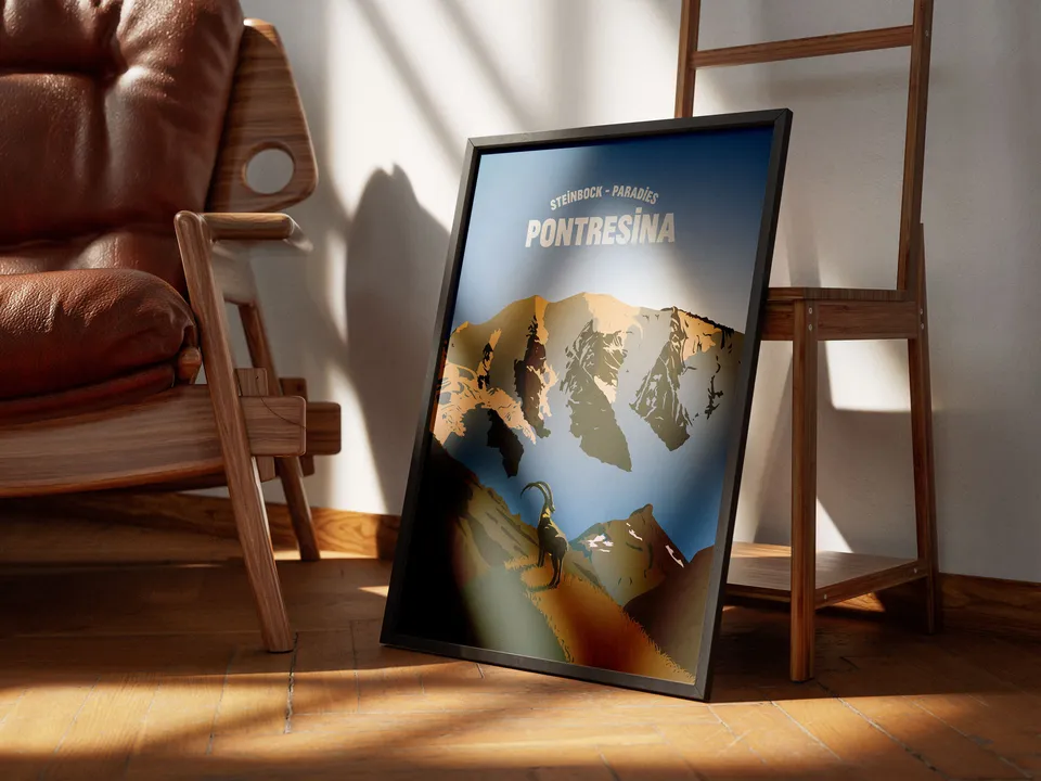
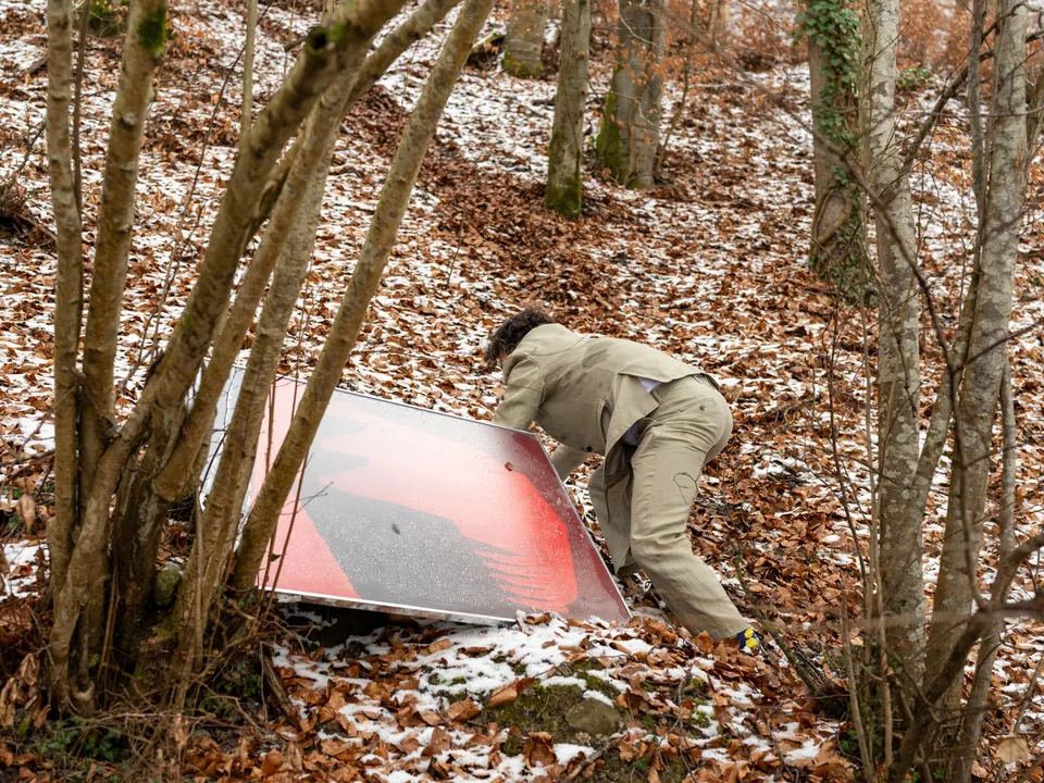
The finished poster: A handmade memento of the wonderful time in Pontresina that guests can take home with them.
Portfolio - Touristenplakat PontresinaRound one: Finding the motif
You approach a brief like this step by step – like an expedition.
My tool of choice is thorough research into the location, the possible mood, and the feeling the image should evoke in the viewer.
The second tool for this expedition is the pencil sketch.
Why pencil sketches? Quickly drawn, quickly discarded, quickly adjusted. For composition and idea development, they remain unbeatable.
I developed three ideas showing the ibex from different perspectives in the surroundings of Pontresina:
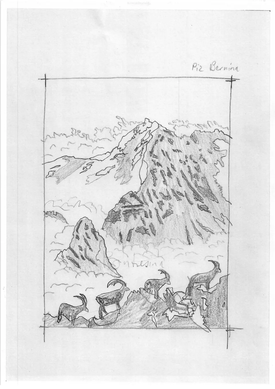
The Piz Bernina with its legendary Bianco Ridge – in the foreground, a group of ibex moves through the mountain landscape.
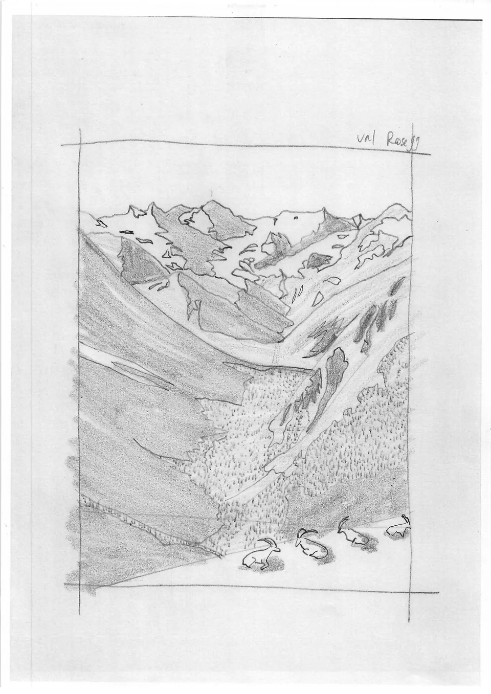
Siesta with a view: Relaxed ibex gaze down into the Val Roseg.
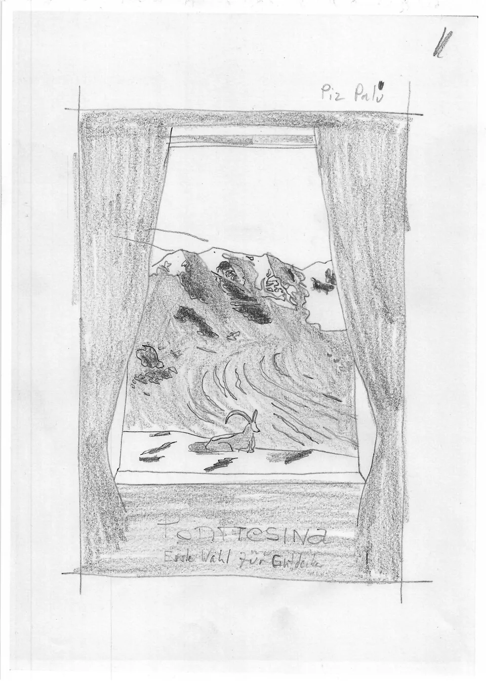
Guests enjoy the framed view of the Piz Palü through the restaurant window, while an ibex strolls casually past.
Motif decision
The client informed me that there are no ibex on the Diavolezza – so that idea was off the table from the start. However, the Piz Palü as a background motif had appealed most to the decision-makers.
They recommended two locations from which the Piz Palü can be seen particularly spectacularly and where ibex are native.
Round two: Narrowing down the motif
Since the decision had been made in favour of the Piz Palü seen from Alp Languard, I now had concrete material to work with. However, as time was limited, it was unfortunately not possible to carry out an actual site visit.
As a picture editor, though, I'm well versed in image archive research. I found sufficient material that allowed me, despite the distance, to develop a motif.
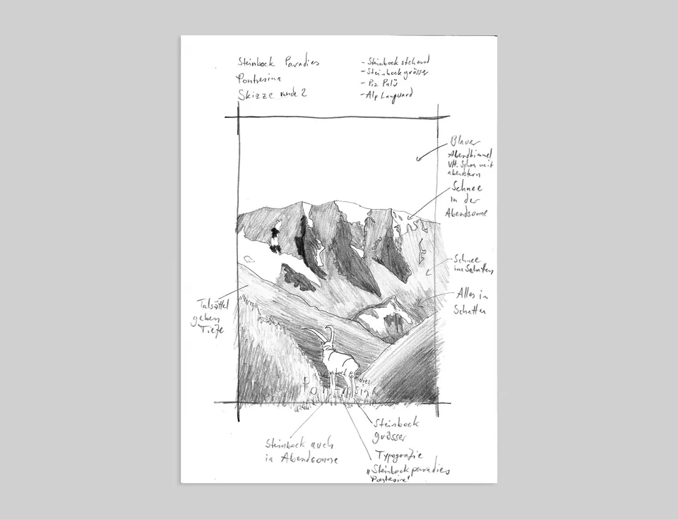
Collaboration in action: The final sketch with handwritten notes from the dialogue with the client.
The client also expressed the wish to show the ibex standing upright and proud – not lying down, sleeping, or walking.
The final sketch is approved by the client and serves as a fairly precise basis for the final artwork. This ensures that we both share the same expectations and are pulling in the same direction, so there are no surprises.
Round three: The final artwork
Now that the pencil sketch has been approved by the client, the pencil can only take me so far. So I switch to the drawing tablet and continue working in the Adobe programs.
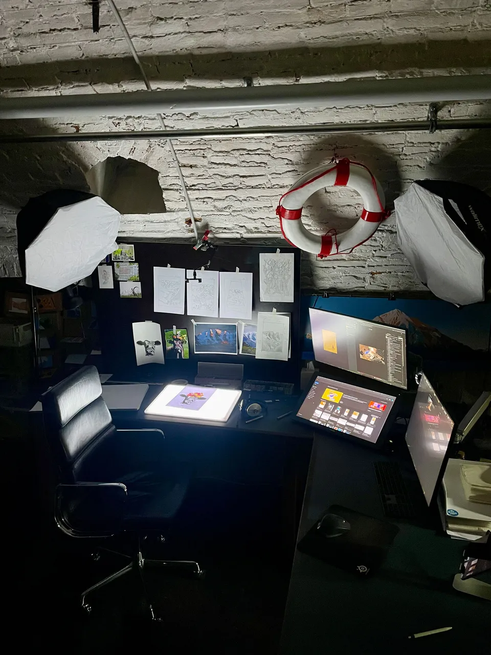
My workspace: light table, drawing tablet – and a life buoy. Better safe than sorry.
Unfortunately, the light table doesn't have a tanning effect.
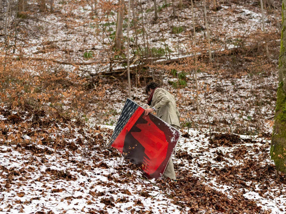
That's how the works looks during creation.
Round four: The colors
A good poster naturally also stands or falls with its colour and typography. I spend an ungodly amount of time searching for the right colour, because with my style of illustration, colour is absolutely central.
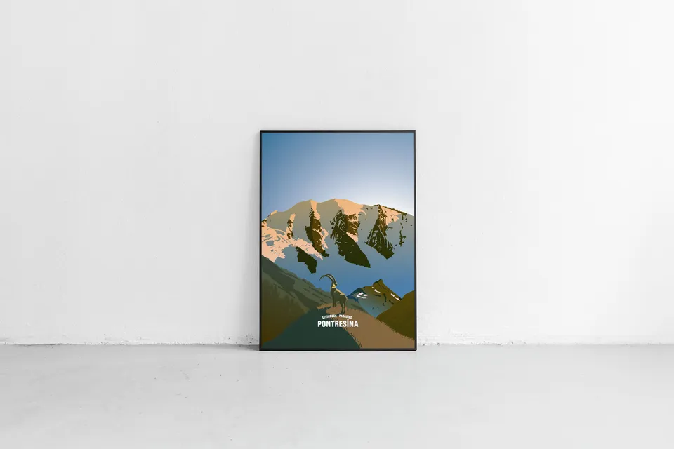
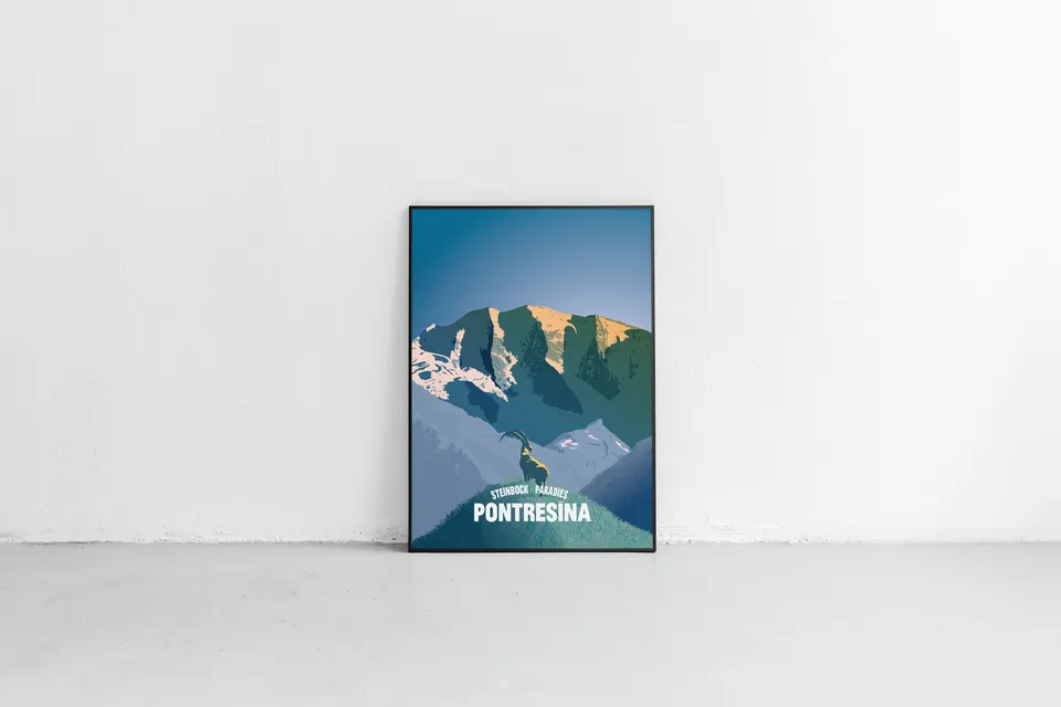
Variant A: A colour variant with rock tones that shift slightly towards red.
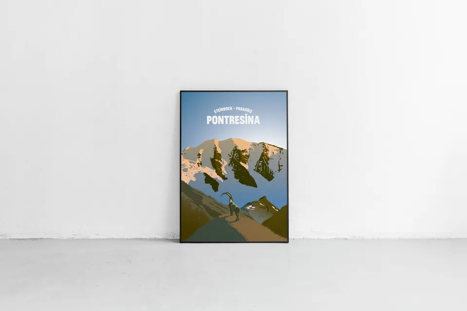
Variant C: Beyond realistic colours – a pure emotional landscape. The sun barely touches the peaks, while the valley still rests in the cold. But not for much longer.
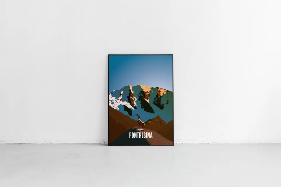
Variant B: Full power. The reds are cranked up – made for maximum punch.
Alongside the colours, I tried out several typographic variants with the client's tagline: "Steinbock-Paradies Pontresina" (Ibex Paradise Pontresina).
Done
The client chose Variant A. And so the poster went to print. You can the poster here in my portfolio.
The poster is also available online via Transhelvetica
The finished design
Tourismus PontresinaTimeless designs that tell real stories.
For tourism professionals who want to create genuine appreciation for their guests with handmade, traditional posters. Let's shape your project together – without AI, and built to last, for a distinctive and authentic brand impact.
Get in touch for tailor-made solutions.
Going the extra mile for great design? Happy to do so.
Link